LANDS' END USABILITY TEST
ABOUT LANDS' END
Lands' End is a well-known American retailer that has sold a wide variety of clothing and footwear since 1963. This vast selection of products prompts a need for a successful interface for their online store.
On their website, they emphasize the value of "comfort"; from the clothes they give you to the customer service they proudly provide. But, how does this comfort translate into the user experience with their desktop site?

INTRODUCTION
My Team and I were tasked with testing the usability of search features and general website navigation mechanics of Lands' End.
The primary benefit of this test was the resulting user insight.
With the displayed interaction with the web interface, the designers for Lands' End can better identify and learn from potential pain points of their products/services.
LANDS' END HOMEPAGE

TEST SUMMARY
We tested 3 different participants for this usability test, examing the website's main search features.
Each user in participation was tasked with the same 3 distinctive tasks as written below.
TASKS
Find two sets of comfortable pajamas for you and a friend.
_1
Add to cart.
Find a set of Supima Cotton bed sheets for a full size bed.
_2
Choose a color option.
Add to cart.
Choose one of Lands’ End’s “Anywheather” fleeces and pair it with any bottoms from a size specific collection.
_3
Add to cart.
SET-UP
DOCUMENTATION
We set up tests by giving the participants pre-interview questions regarding Administrators tested each participant individually. Each test began with pre-interview questions and ended with some survey-style questions
My team and I utilized the powerful functions of Zoom screen and recordings as well as its transcription tool.
Additionally, we took supplemental notes during and after the test and synthesized all of our findings into a Miro Board summary.
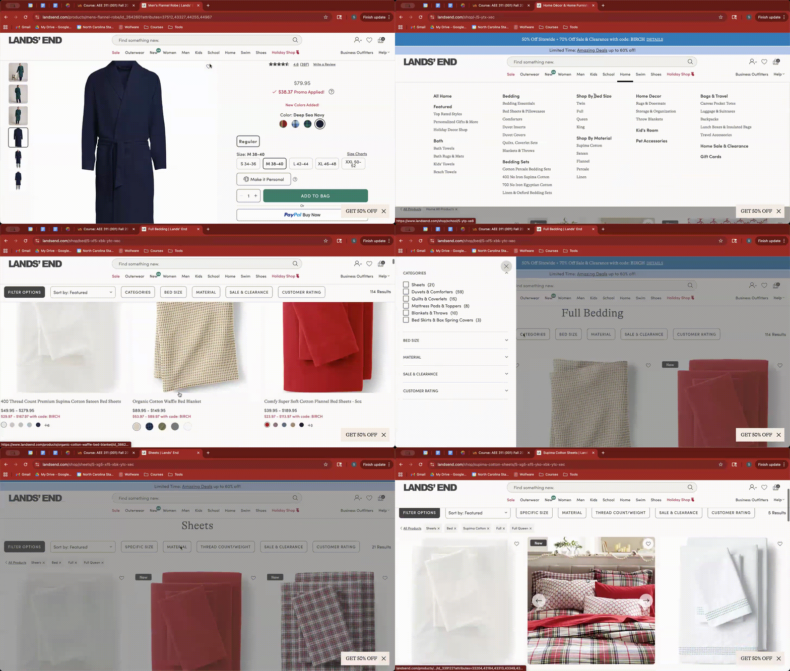
from Test 03 –– Task 01
RESULTS & FINDINGS
-
All 3 users found using the guide tabs under the search bar intuitive.
-
(most even opting to use them in place of search bar)
-
-
All 3 users find trouble with the amount of text and information that is provided in the tab pop downs.
-
2 of 3 users struggled to find “Anywheather.”
-
(from task 3)
-
-
2 of 3 users suggested utilizing a more clear visual heirarchy.
-
(e.g., use varying font pt. sizes and increasing the size of the search bar)
-

POSITIVES
Typed Observation Notes –– Test 01

I think the 'home' section is definitely organized better than the clothing [section].
–– Participant 01

PAIN-POINTS
I didn’t even see ‘pajamas & robes’ because my eyes were just going to the big headers.
–– Participant 02


SUGGESTIONS
FROM USERS

KEY TAKEAWAYS & REFLECTIONS
After gathering and analyzing our data, we found three main areas of improvement that Lands' End could address to improve their site's usability.
(1) Simplification. The tab headers under the search bar are useful in theory, however it would benefit them to simplify and perhaps consolidate the amount of information display while hovering the cursor over sections. Some users found it to be an overwhelming amount of information displayed which gave them trouble finding what they are looking for.
(2) Readability. There is quite a lot of text under the search drop downs. When hovering the cursor over, the text that drops down is all close in font size, with only a slight bold distinguishing the difference between main category and subheading. Perhaps it would be helpful for the designers of this site to implement a clear hierarchy, so users' vision is guided more fluently.
(3) Signification. Most users ended up utilizing the drop down tab header sections, as opposed to the typical search bar. Users seem drawn to the tabs in general, but perhaps the size could be increased, as well as the placement varied of the search bar. This could help signify to use the search bar function when looking up a very specific item, which many folks end up coming to the site for.
As a group, we expected users to struggle with information overload due to the nature of Lands' End website being a large-inventory store. We were expecting longer test times as well and found that most of this came to be true. The users seemed to be rushing through their testing, which we found to be perhaps a symptom of them knowing they were being timed. In retrospect, we probably would withhold that information until the end of the test in order to emphasize that the user isn't being timed under any performance merit and that we were testing only the interface itself. We also considered the audience of Lands' End, and that bringing in the target segments at varying levels of digital fluency would give us an even more meaningful test of the design. Despite all of this, the test turned out to be a success and gave my parents and I a great opportunity to do a close study on a real digital product and understand both the intricate and the broad ways in which to view the user's experience.